Why Claude is Special
Claude used to frustrate me. Or, less politely: Claude would piss me off.
For years, friends would laud Claude Code and we’d debate, as I didn’t like it. I’d stick with OpenAI models in whatever harness I was using.
With each new Anthropic model, Claude Code update, ecosystem hype, or just fatigue from hearing from friends, I’d try it again, shake my head, and put it aside.
Then in November 2025, as many people noticed, there was “disturbance in the Force”, and agent coding got really good (MCP + plugins + skills + model updates). I found Claude was now quite a bit ahead of everyone else.
Perhaps I’ve become a fanboy. That’s okay; I think you should use what works for you, where and when it does. (That keeps changing in the craziness that is AI.)
But here is an anecdote for why I think Claude is special.
Several years ago, I bought a domain, savethetokens.com. I had plans to build a website using the name, but never did. Given the Nov 2025 jump in AI leverage, I finally got around to working on it. Like any good engineer, I immediately went to a bikeshedding topic (instead of focusing on content and structure): the logo.
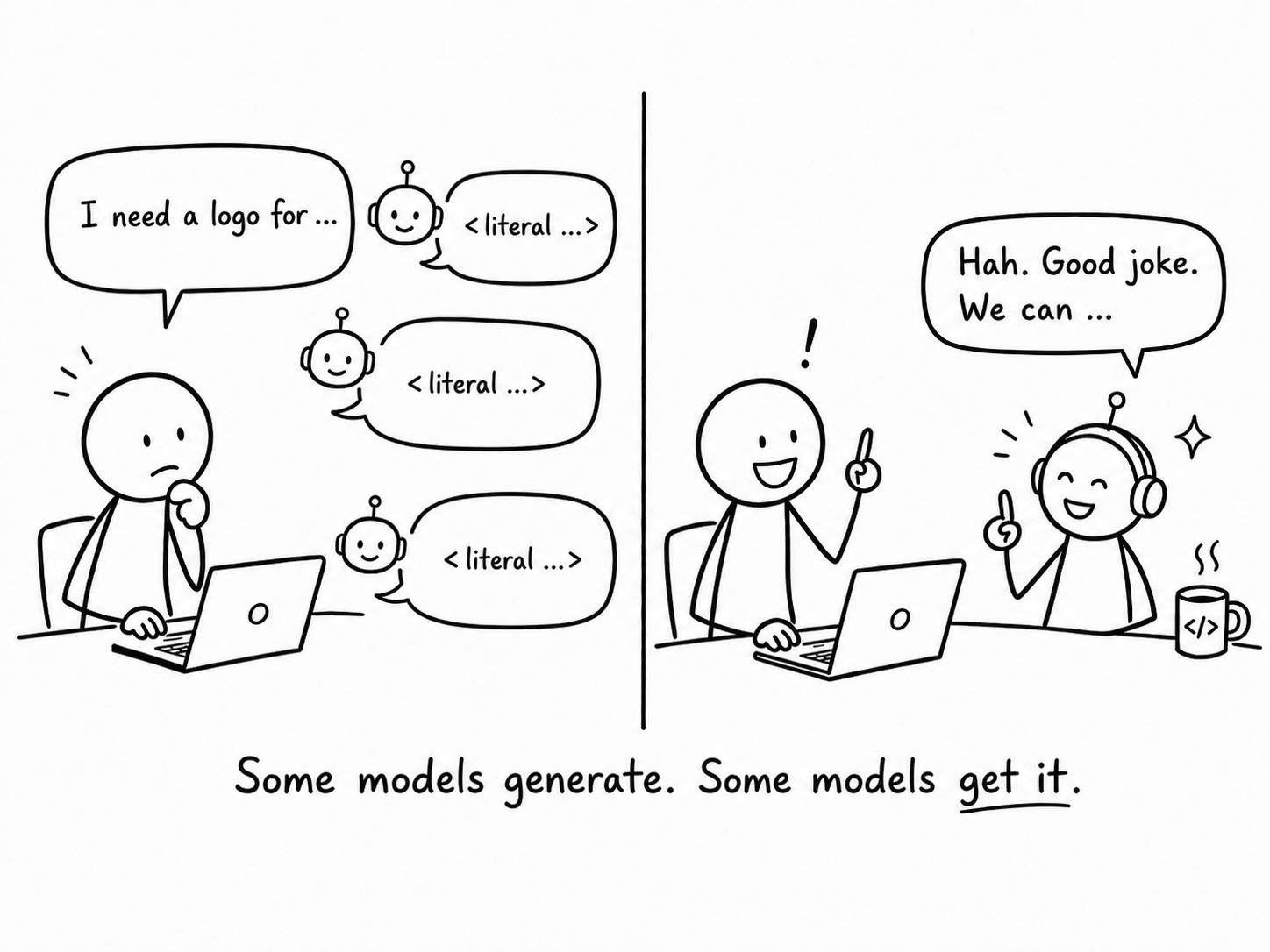
I tried all the AI tools. The logo generators were bad. Gemini and DALL-E made pretty images, but they looked like someone receiving communion (for those who know what that is) or a gambler protecting their chips.
So I turned to my new friend, Claude, and asked:
I also need a logo for "Save the Tokens", a personal AI focussed website: blogs, tools, etc.

What do you suggest?
and Claude responded
Good moment to zoom out before any pixels. A few strategic things first.

The name does real work. "Save the Tokens" is a joke that lands specifically for
your audience — AI devs who've stared at tokenizer outputs. A smart identity should
respect that wit rather than paper over it with generic tech aesthetics. The worst
outcome here is a logo that looks like every other AI dev-tools site; the best outcome
 is something that makes the audience smile the first time they see it.

...

Three directions for the parent brand, in order of my preference:

1. Tokens as the visual language. "Save the Tokens" literally tokenized — each
word or sub-word in its own colored box, like a tokenizer visualization. Your readers
have seen this pattern a thousand times; it'll read instantly.
and it gave me this logo

I suggested we look at other tokenizers, so the token split isn’t the same as the word split. Then I used Claude Design (launched the same day or so) to clean up the final logo.
But the key for me: Claude got the joke (immediately). And it was the only AI that did. Claude gets concepts in a way other models don’t. That matters most on novel, innovative problems, not the kind that’s really just remixing Stack Overflow into a shell script. That work has nuance and complexity. Claude feels like a collaborator, not just a lackey who codes on the side to free up my time.
So yeah, maybe I am just a fanboy. (My wife teases / questions my relationship with Claude.)
I’ve had a lot of fun conversations with Claude. One standout: a discussion about the “scolding” hypothesis. But that is for another time.